When you pay for ads, every click costs money. Sending that traffic to a busy home page, with a dozen menu items and five different offers, is like paying for people to walk into your shop and then making them search for the thing they came for.
A landing page fixes that. One page, one offer, one action. It loads fast, says exactly what the ad promised and makes the next step obvious.
I'm Aldrian, an independent developer and designer. I build landing pages for ads, launches, promos, events, lead magnets and products.
A real example
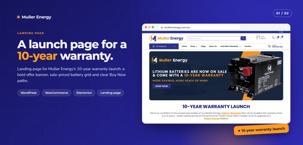
For Muller Energy, I built a campaign landing page for their 10-year warranty launch. Muller had doubled its battery warranty to 10 years and cut prices at the same time. The launch needed one focused page that made the offer obvious and got shoppers to a product fast.
I built it inside their existing WordPress and WooCommerce store: a campaign banner and headline up top, a short message about the new warranty, then a product grid where every card shows the warranty badge, the old and new price, and Buy Now and View Product buttons. One page carried the whole launch offer, and every product was one click from checkout. When I measured it, it scored 100 for SEO and 97 for accessibility in Lighthouse on desktop.
What makes a landing page work
Message match
The headline should echo the ad. If the ad says "10-year warranty on lithium batteries," the page should say it too, immediately. Visitors who don't see what they clicked for leave.
One clear action
Buy, book, sign up, request a quote, download. One primary action, repeated at sensible points, with no competing offers.
Fast loading
Ad traffic is mostly mobile and often impatient. Every second of loading loses people you already paid for. I keep landing pages light, with optimized images, minimal scripts and no heavy sliders.
Proof
Real product photos, genuine reviews you've received, warranties, guarantees and clear details. Honest proof converts better than hype.
Answers to objections
A short FAQ or section that answers the questions stopping people from acting: price, delivery, warranty, how it works, what happens next.
Nothing to distract
Usually no full menu, no sidebar and no links leading away from the offer.
Types of landing pages I build
- Product launch pages with offer, product details and buy buttons
- Promo and sale pages with countdowns and featured products
- Lead generation pages with a short form for quotes or consultations. See lead generation websites.
- Event and webinar registration pages
- Lead magnet pages for guides, checklists and downloads
- App and SaaS pages for sign-ups and waitlists
- Service pages for ads, focused on one service in one area
Built where it makes sense
- Inside your existing site, like the Muller page inside WooCommerce, when you want it to share your store, checkout and branding
- As a standalone static page, when speed is the top priority and the page needs to stand on its own
- On a subdomain or separate domain, for campaigns that run apart from your main brand
Tracking you can trust
Ads are only as good as the data behind them. I set up:
- Analytics events for key actions like form submissions and purchases
- Ad platform pixels and conversion tracking, loaded efficiently
- UTM parameters preserved through forms
- Consent handling where required
I check that conversions actually fire before your campaign starts, so you're not optimizing ads on broken data.
Testing and improving
Good landing pages get better over time. I can set up variations to test headlines, offers or layouts, and help you read the results sensibly. Small, focused changes based on real data usually beat big redesigns.
Common landing page mistakes
Sending ads to the home page. Too many choices, too little focus.
Slow hero videos and sliders. They look impressive and lose mobile visitors.
Long forms. Ask only for what you need right now.
Vague headlines. "Welcome to our company" says nothing. Say what you offer and why it matters.
Broken tracking. Running ads for weeks before noticing conversions weren't recorded.
Fake urgency. Countdown timers that reset on refresh damage trust. Real deadlines only.
Speed and accessibility built in
A landing page should work for everyone: readable text, good contrast, large buttons and forms that work with screen readers. Accessibility also tends to improve conversions, because clear pages are easier for everybody.
What happens after someone converts
The landing page's job doesn't end at the click. A good thank-you page confirms what happens next, sets expectations and can offer a sensible next step. Confirmation emails should arrive within seconds, and leads should land somewhere your team will see them right away. I set this up as part of the page, because the best ad in the world is wasted if the follow-up is slow.
How we'd work
- We talk about your offer, audience, ads and goal.
- You get a quote with scope, timeline and fixed price.
- I write a structure and draft copy with you, or work with your copy.
- I design and build, sharing preview links.
- We test speed, forms, tracking and mobile layout.
- We launch, and I can help with improvements after the first results.
Let's build a page worth the ad spend
Tell me about your campaign. I'll reply with a plan and a fixed quote.